Antarctica looks bigger on a map because most world maps use the Mercator projection, which distorts sizes near the poles. On a globe, the sizes are more accurate, and Antarctica appears smaller due to its position near the bottom.
ConfusedScr3aming
1 month ago
Greenland is the same principle.
CpuJunky
1 month ago
[ANT-USA.jpg (1250×1250)])
It’s not as big as you think it is. (That’s what she said)
MONKA_hmmmmm
1 month ago
I love spherical geometry
R0uxlsKaard
1 month ago
Seems like antarctica didn’t get lost in the ‘sea’, but the ‘sea’ got lost in antarctica.
Simple-Mulberry64
1 month ago
Greenland compared to fuggin Colombia is absolutely insane on a flat map

Antarctica looks bigger on a map because most world maps use the Mercator projection, which distorts sizes near the poles. On a globe, the sizes are more accurate, and Antarctica appears smaller due to its position near the bottom.
Greenland is the same principle.
[ANT-USA.jpg (1250×1250)]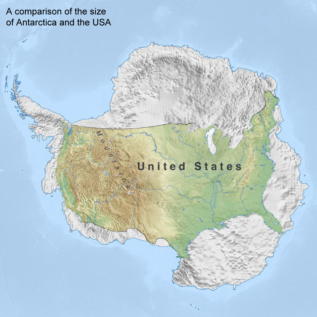 )
)
It’s not as big as you think it is. (That’s what she said)
I love spherical geometry
Seems like antarctica didn’t get lost in the ‘sea’, but the ‘sea’ got lost in antarctica.
Greenland compared to fuggin Colombia is absolutely insane on a flat map